Radial Menu Widget
This Radial Menu dynamically accepts children without the need for building static textures.
Examples are placed in WB_RadialMenu, PingSpawner, and WB_Mobile in the plugin content.
How To Use
- Drag the Radial Menu to your widget.
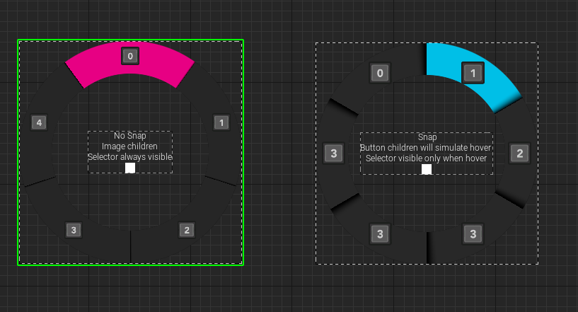
- Add children by dragging and dropping them into the menu. Buttons can also be added if you want to simulate hovering effects (buttons will be cosmetic only).
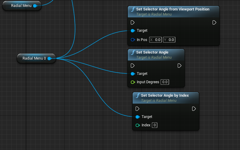
- Pass input to the Radial Menu using one of these functions:
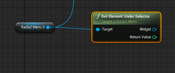
- Get the output using this function (returns the selected index and widget):
Variables and Functions
| Name | Type | Description |
|---|---|---|
| RadialMenuBaseMaterial | UMaterialInterface* | The material used for the Radial Menu base. |
| SelectorColor | FLinearColor | Foreground color used for the selector. |
| BackgroundColor | FLinearColor | Background color used for the Radial Menu. |
| DividerOpacity | float | Opacity of the divider between each element. |
| OptionsPadding | float | Padding for options relative to the widget size. |
| BackgroundPadding | float | Background padding relative to the widget size. |
| SnapSelector | bool | Determines if the selector should snap instead of transitioning smoothly. |
| HideSelectorWhenNotHovered | bool | Determines if the selector should be visible only when hovered with the mouse. |
| BackgroundRotationOffset | float | Rotation offset for the background (0-90 degrees, starting from top and clockwise). Default value is 0.0. |
| SetSelectorColor | Function | Setter function to set the selector color. |
| SetSelectorAngle | Function | Setter function to set the angle of the selector (0-360 degrees, starting from top and clockwise). |
| SetSelectorAngleByIndex | Function | Setter function to set the selector angle based on an item index. |
| SetSelectorAngleFromViewportPosition | Function | Setter function to calculate the angle from viewport position. |
| GetElementUnderSelector | Function, BlueprintPure | Getter function to get the element under the selector. |
| SetSelectorVisibility | Function | Setter function to set the visibility of the selector. |
| MouseDown | Event | Event delegate triggered when a mouse button is pressed down. |
| MouseMove | Event | Event delegate triggered when the mouse is moved. |
| MouseUp | Event | Event delegate triggered when a mouse button is released. |
| TouchStart | Event | Event delegate triggered when a touch event starts. |
| TouchMove | Event | Event delegate triggered when a touch event is moved. |
| TouchEnd | Event | Event delegate triggered when a touch event ends. |